BEWOLAR
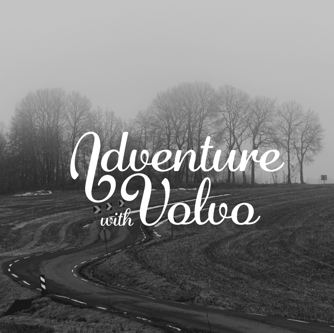
Adventure with Volvo
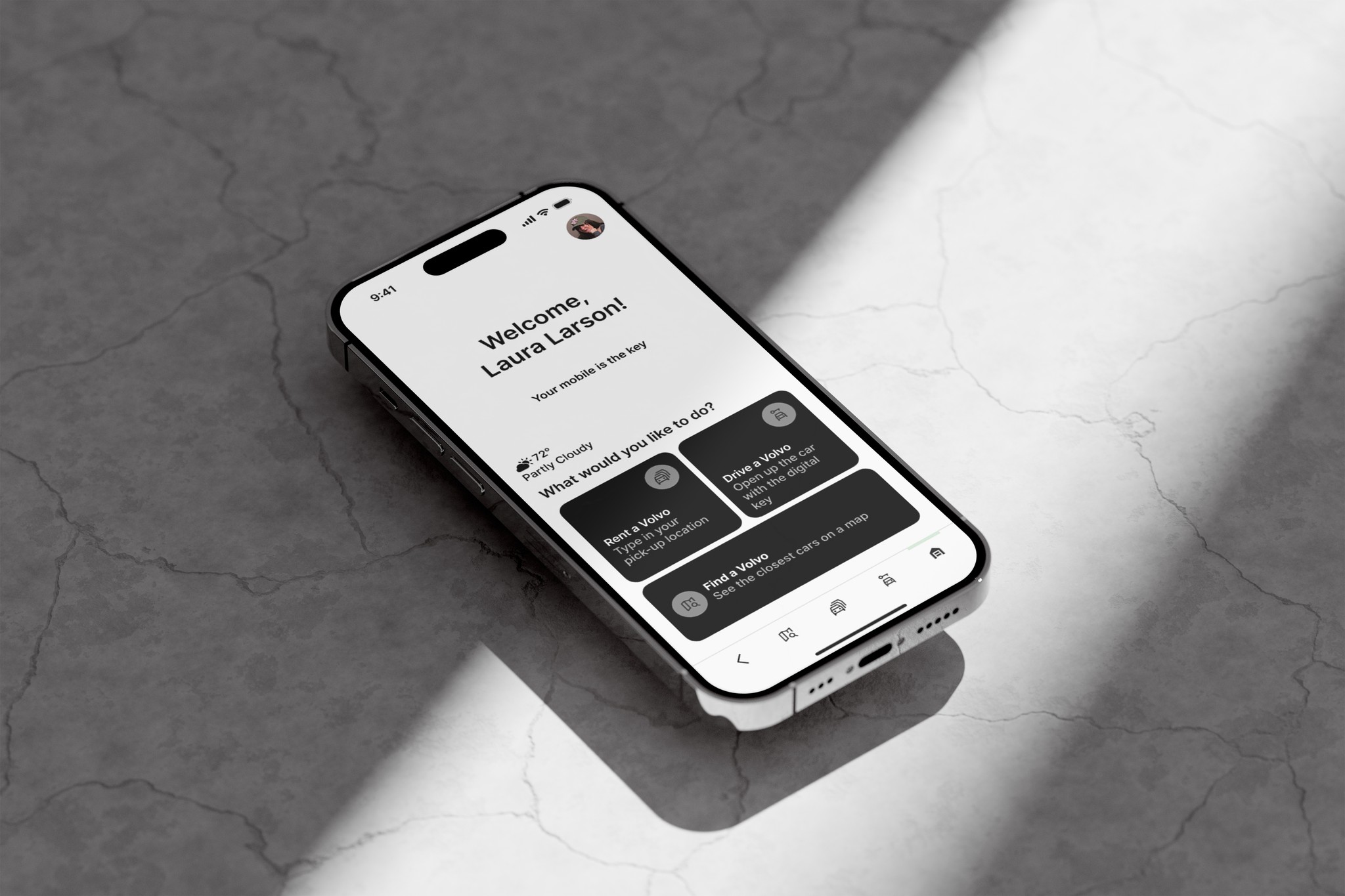
A fictional car rental app, to show the flow of the booking process. Everything happens from the mobile. The mobile is the key to the car. Download the app, and drive straight away.
See the prototype
The Challenge
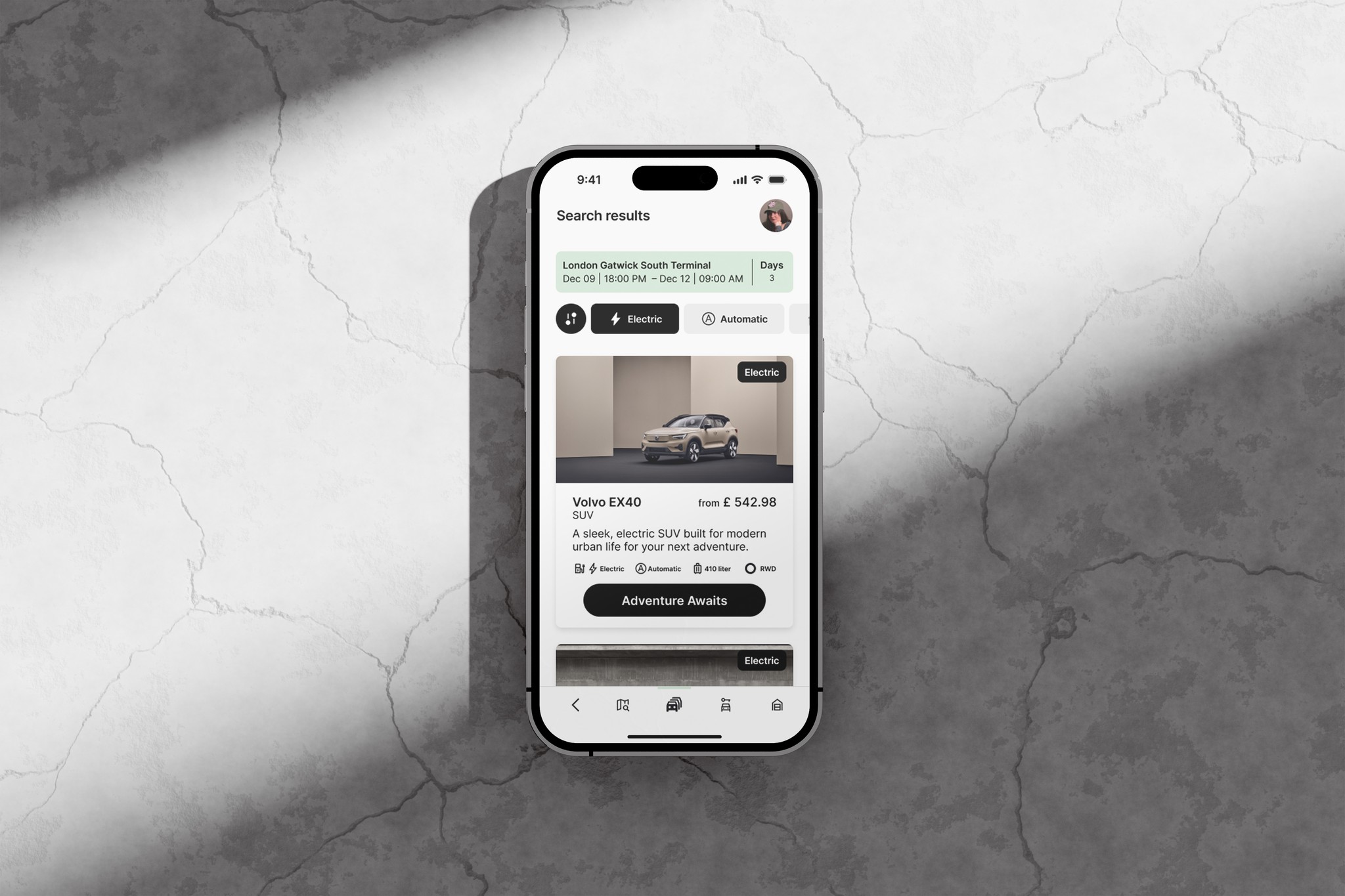
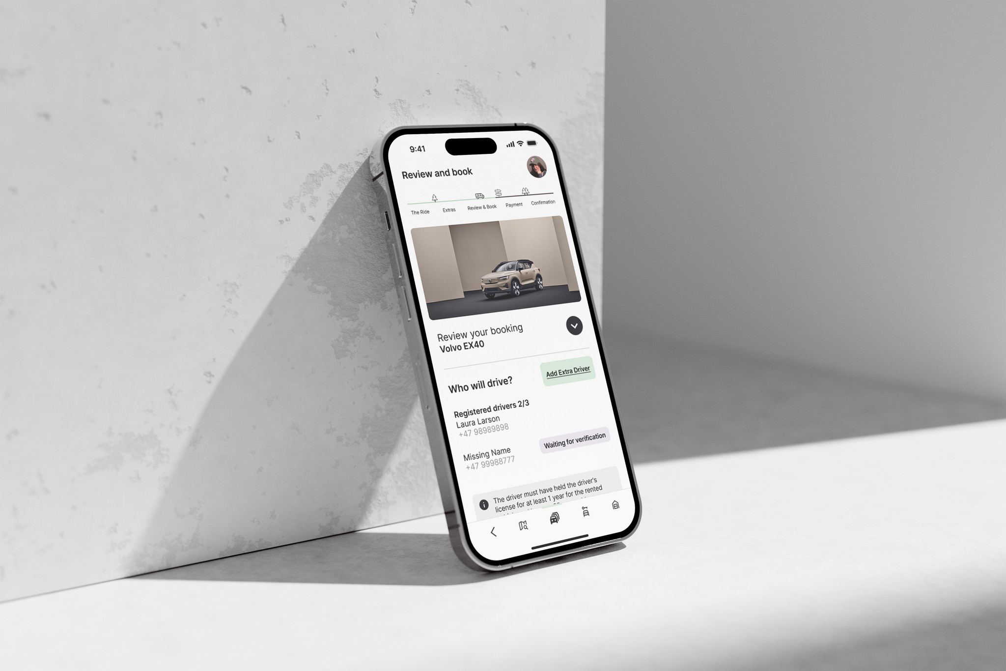
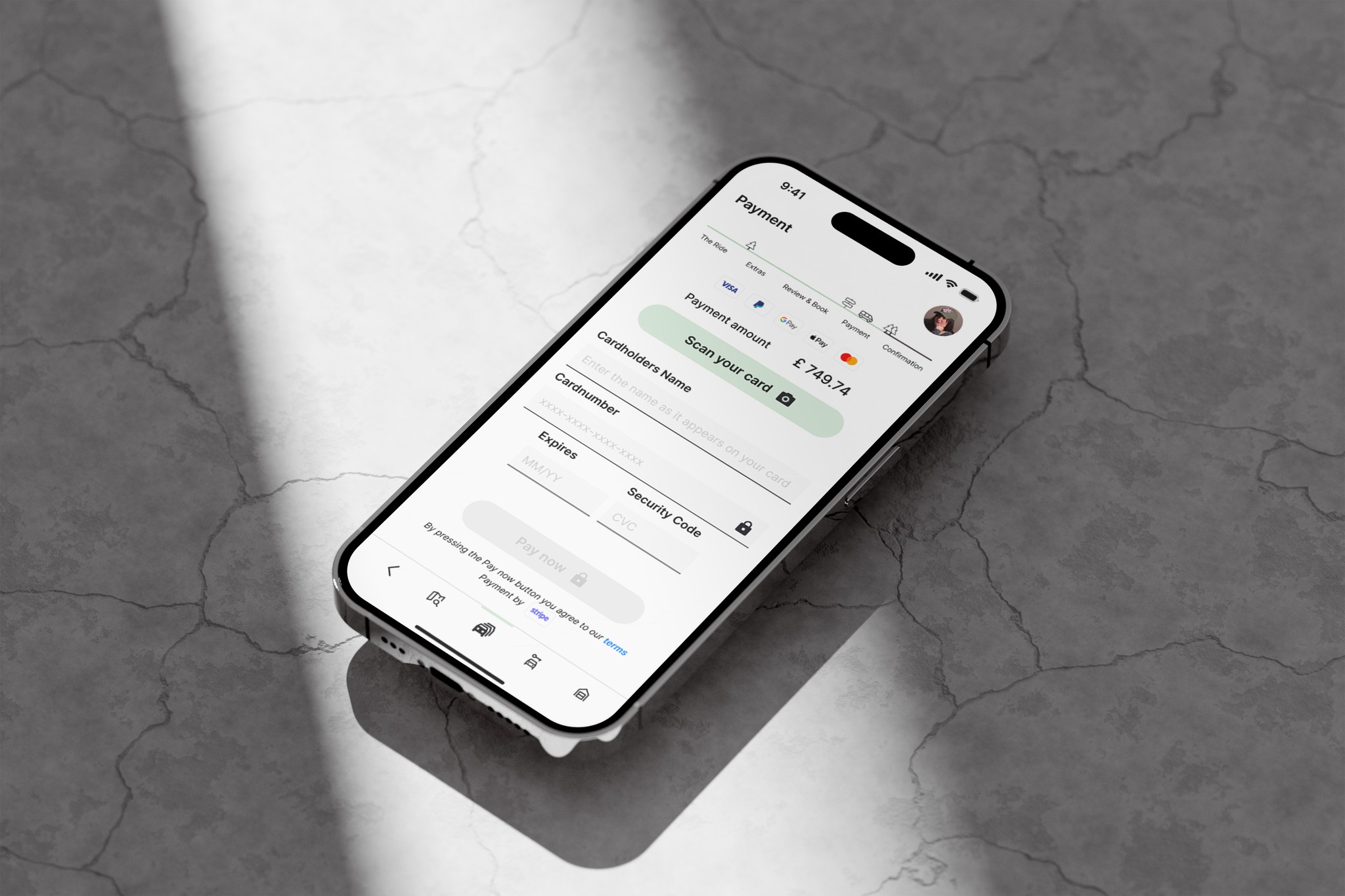
Designing a user-friendly booking process for Adventure with Volvo, a fictional car rental company. The process needed to cover key steps such as searching for a location, selecting a date and time, choosing a car, adding an extra driver, viewing pricing, selecting extras, and reviewing the summary. To achieve this, I followed the full UX process, including customer interviews, usability testing, customer journey map, and creating a flowchart before starting with sketching.
The Project Goals
My goal was to understand user challenges and pain points in the booking process and apply the UX design process to address them. I aimed to design and build a clickable prototype for user testing, along with a detailed set of annotations for the software development team.
My Role: UX-Designer
Time: 6-12 months (approximately 8 hours a week)
Affinity Diagram
I synthesized findings from the usability tests and survey into post-it notes (pain points, suggestions, clever ideas) and grouped them to identify common themes.
Look at my post-it board
Customer Journey Map
I created a journey map that visualizes the entire booking process, highlighting user goals, emotions, frustrations, and touchpoints. This helped identify critical pain points and opportunities for improvement.
See my lovely map
Analysis
Note-taking
I took detailed notes from two pre-recorded usability tests provided by the UX Design Institute. Observing users interact with two different car rental apps helped me identify their goals, behaviors, pain points, and areas for improvement.
Read my notes
Usability test
I ran three usability tests with one participant to understand user frustrations and uncover clever design solutions from competitor apps. I was able to observe user behavior and expressions closely, which provided valuable feedback for my own prototype.
Ask to see recordings
Research
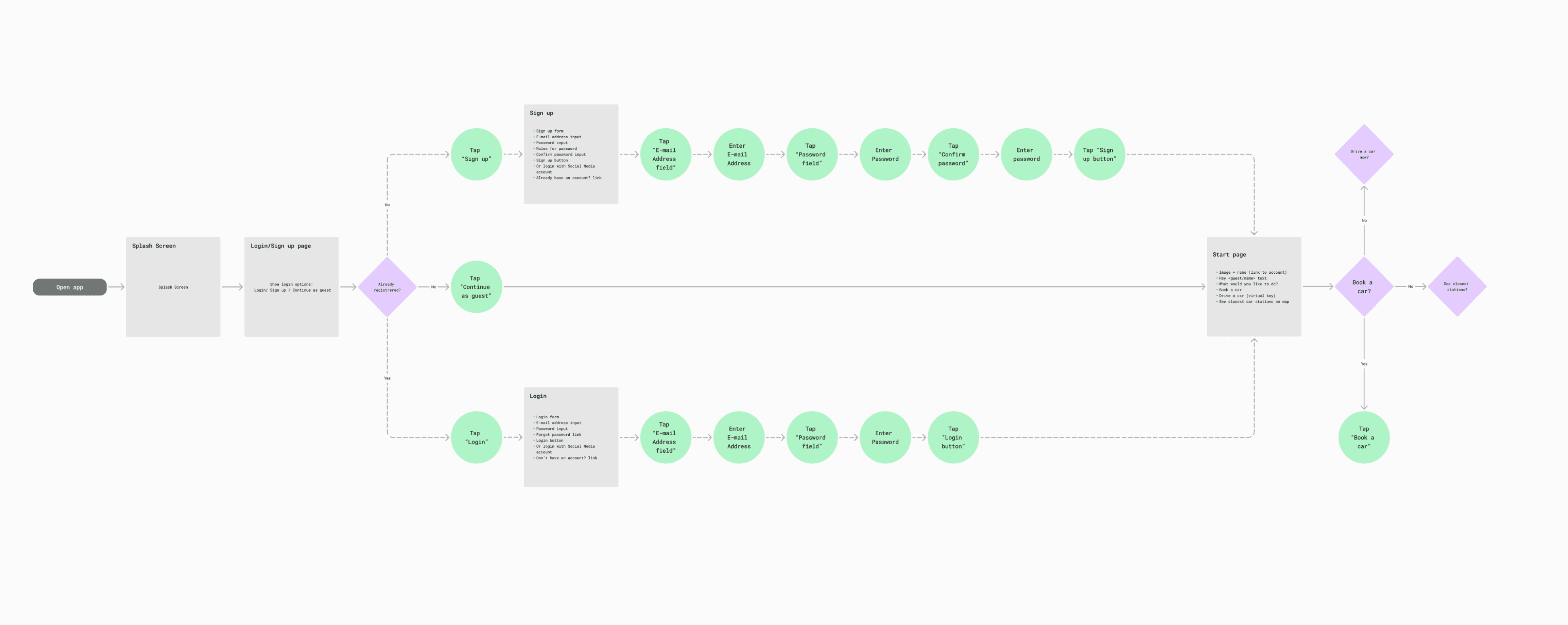
Flow Diagram
I mapped out the "Happy Path" to visualize the ideal booking flow. This step helped me refine the process before sketching and allowed me to break the experience down into screens, actions, and states.
Go to the Flow
Interaction Design
Based on insights gathered from the previous stages, I sketched out initial concepts of the booking flow using pen and paper.
See how I worked off screen
Concept Design
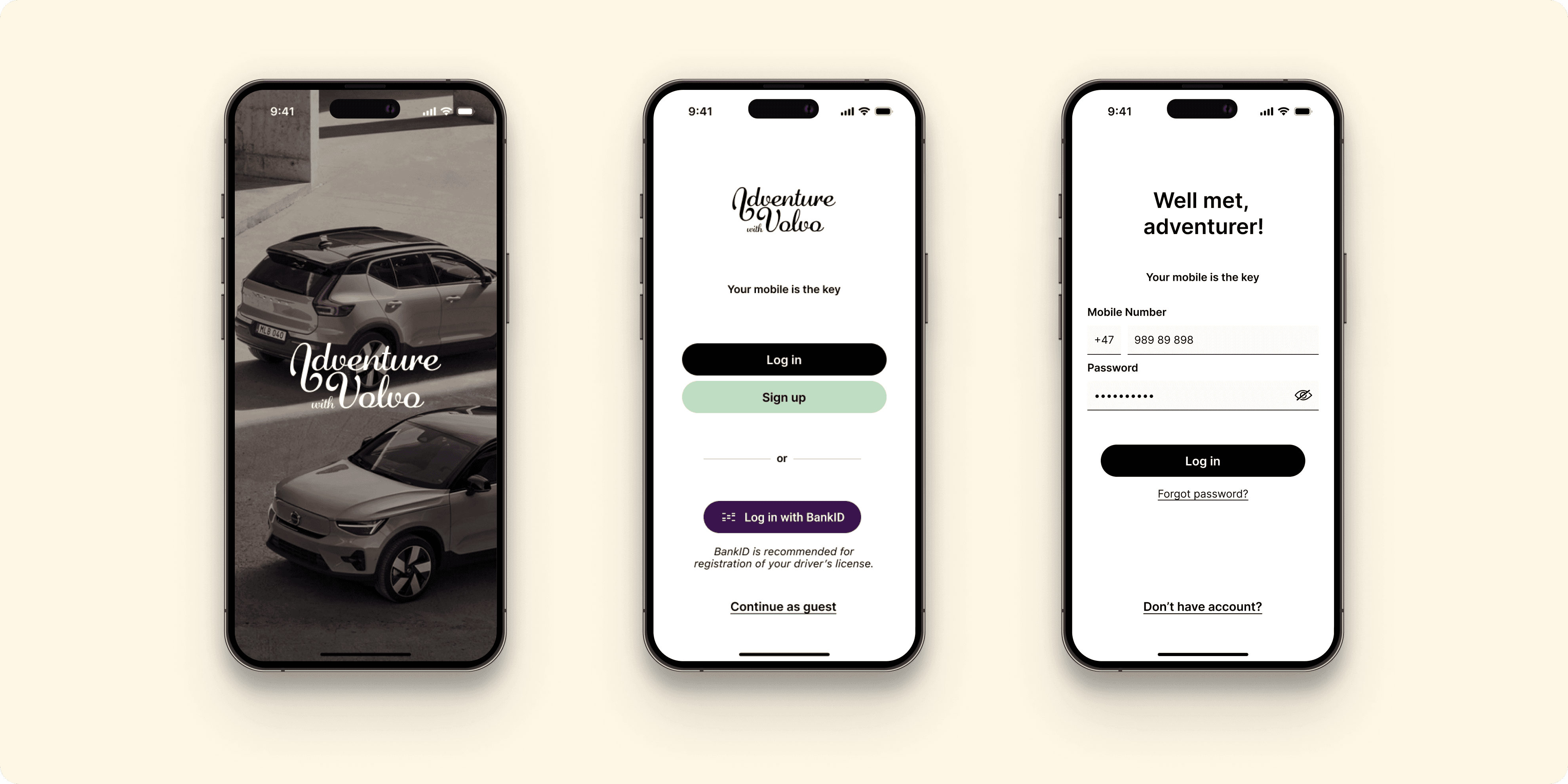
Prototype
I designed a high-fidelity prototype of the booking process. Throughout the prototyping phase, I conducted usability tests and incorporated feedback from peers and student teams to validate design decisions.
See the prototype
Annotations
I added comments and design rationale as annotations directly in the Figma file to clarify specific decisions and flows.
Read my annotations
Prototype & Annotations
Thank you for your time!
Let’s make your user experience smoother than a swipe on Tinder.
Client
Fictional - Volvo
Role
UX-designer
Type
UX-design
Year
2025
Tools
Mobile & Desktop, Telly, Adobe Indesign, Pen & Paper, Zoom, LetsView, Miro, FigJam, Figma
BEWOLAR
© 2025 Bettina Wolar
Find me on socials: @bewolar